Tutorly: An App to Find 1-1 Tuition
User-Centered Design for Enhanced Educational Accessibility
Project Overview
Project Type: App Testing and Development
Industry: Ed-Tech
Role: UX Research, Usability Testing, UX/UI Design
Goals: Build a hi-fi search and booking function for the Tutorly App
Project Duration: November 2024 - April 2025

Context
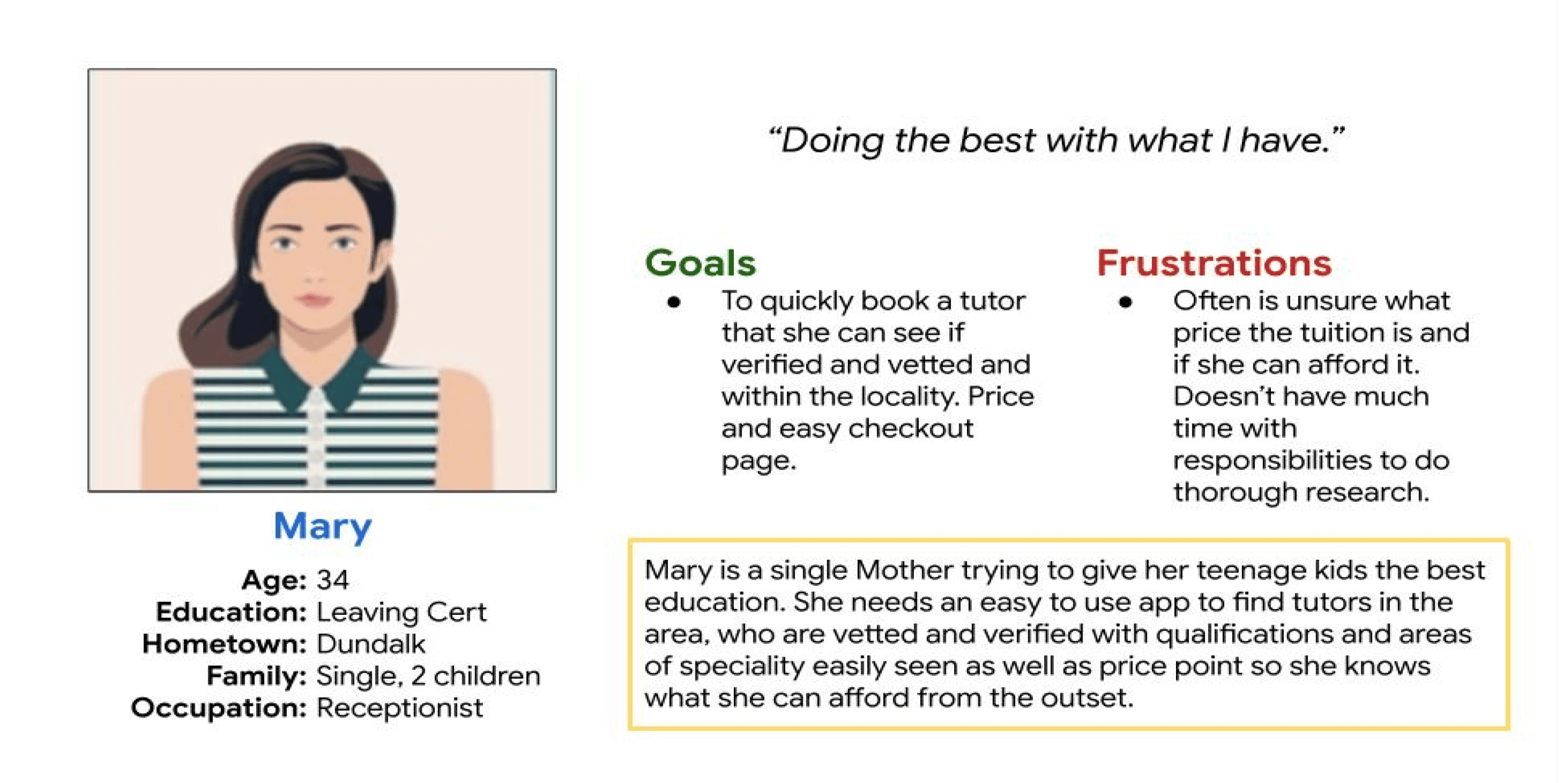
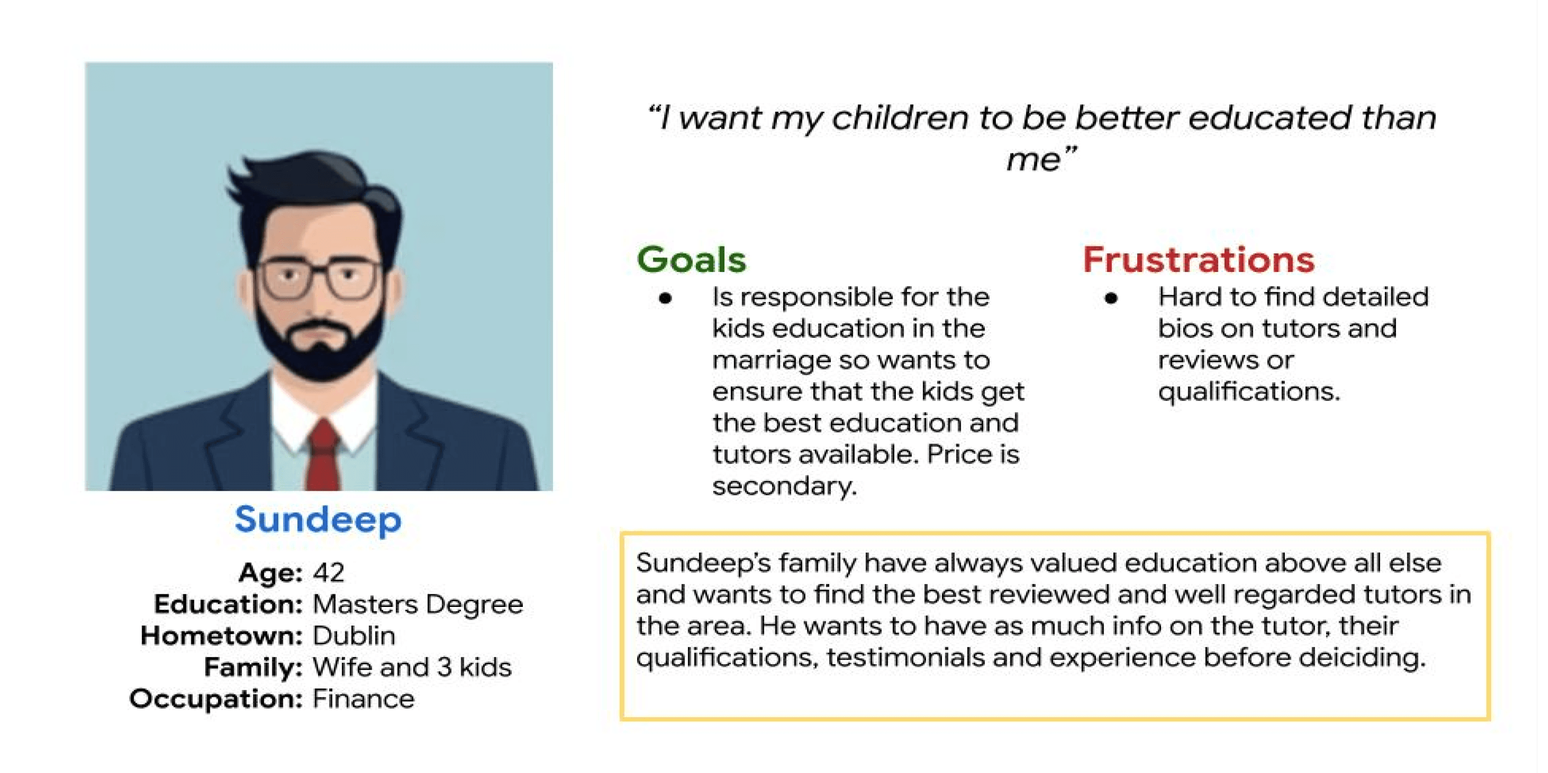
This project was part of my UX certificate course from Google to test UX principles and learn how to build a hi-fi prototype app using Figma. I know this is a current issue facing parents and students in Ireland, so I was able to empathise and build personas based on real people, making this project feel real, rather than a non-contextual study piece.
The Problem
The demand to achieve the best Leaving Cert (Irish final school exams) has become evermore competitive. Many parents are turning to extra 1-1 tuition for their children to help them excel in their exams, with hopes they will get accepted to the university course they hope for. The demand is growing and typically tutors are found through word of mouth. This leaves some students unable to find tutors. I want to create an app that makes it accessible for all students to find a tutor for extra tuiton.
Goals
Finding the top 3-5 pain-points and needs of users when finding and booking a tutor through interviews
To develop and iteratively test a MVP to search and book a tutor based on research findings
To demonstrate proficiency in hi-fi prototyping by creating a visually polished and interactive search and booking system for the Tutor App, by scoring at least 4 out of 5 from a user satisfaction score
3-5 Pain Points
MVP
Hi-fi Prototype
Discovery & Research
To test my first goal of finding the key pain-points experienced when currently booking a tutor, I conducted semi-structure interviews of a student (over 18), 2 parents and a teacher who currently provides extra tuition. I made sure to find a mix of users from cities (Dublin) and rural towns (Donegal).
Semi-structured user interviews
I used a mix of phone and in-person interviews due to location and I modified the questions based on the different users. It was important to find an in-depth understanding of each stakeholder’s pain-points to make sure the app fits all their needs. My questions focused on the current methods used to book tuition, how tutors are found and what their version of an ideal situation find and book tutors would be.
Key Findings
Tutors are mostly found through word of mouth. Parents are students tend to be frustrated that tutor’s schedules are booked up quickly and it’s hard to find alternatives. The teacher told me that he is inundated with messages and has no way to show he’s fully booked.
Parents didn’t know if they were paying over the odds due to the perceived lack of tutors. Prices seem to be constantly rising said a parent who is finding tutors for their 3rd child. The tutor mentioned larger institutions took a large chunk of the fee, inflating the price.
Both parents and the tutor said they sourced tuition through paper ads in local shops. Parent’s cited the lack of understanding credibility and verification with university students often advertising.
Word of Mouth
No Price Clarity
Lack of Credibility
Limited Options
User Personas
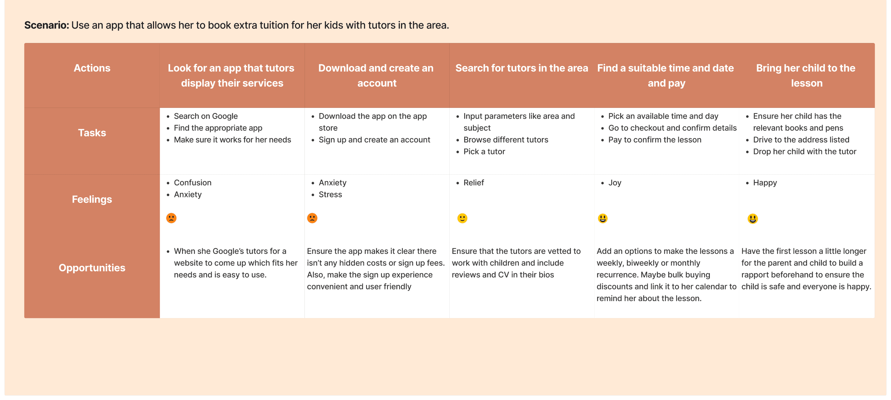
User Journey Map
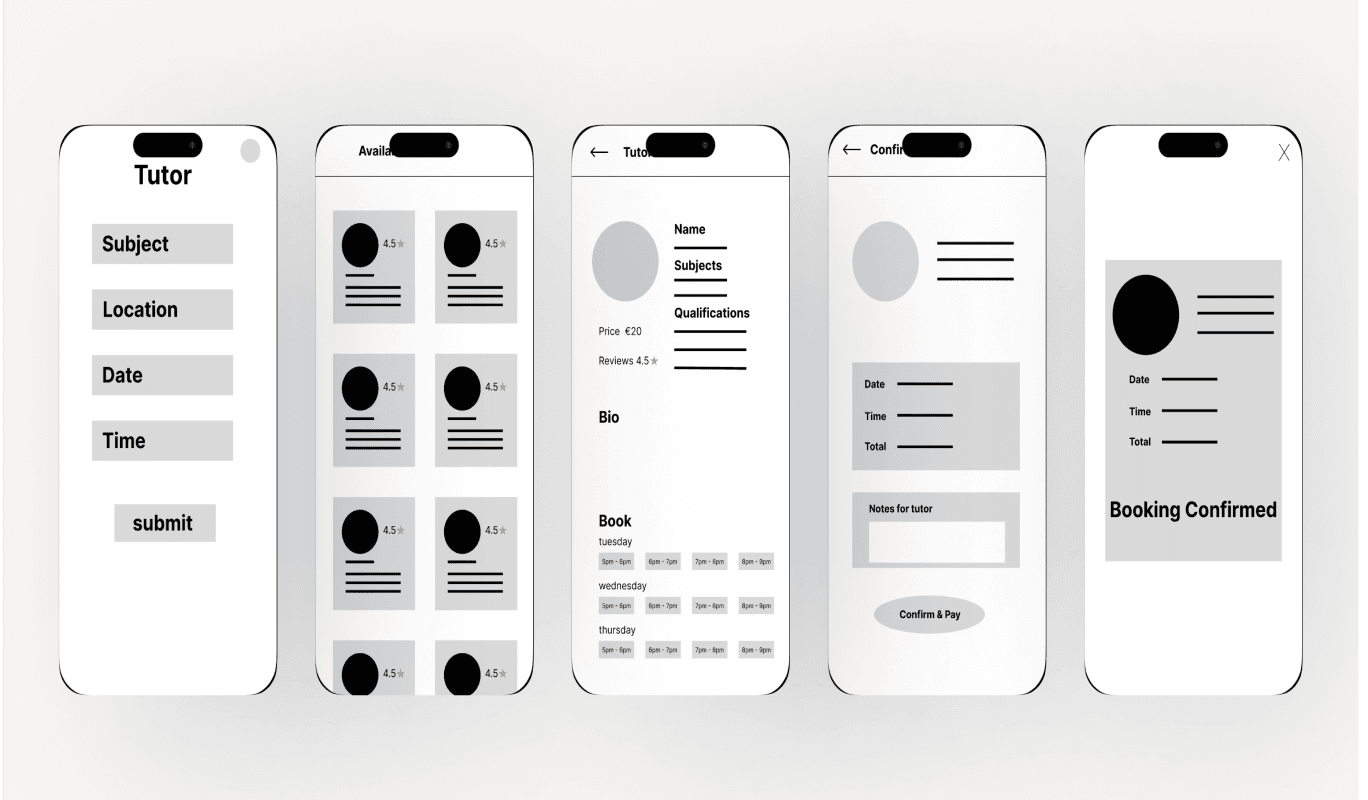
Lo-fi Mock-up
Based on my findings, I iterated several options on paper wireframes, which I then brought to Figma to create a lo-fi mock-up. I included tutor reviews, price and a list of availability the tutor has. This directly solves the four main pain-points found in the research: lack of clarity of availability, price comparison, verification and credibility and an online option to book a tutor.
Usability Testing
I had 5 people test a lo-fi prototype of booking a lesson.
I’m glad I tested the lo-fi prototype before moving forward. Basic mistakes like not adding a confirmation button is an easy fix and better to catch at this stage. Otherwise, there’s only a small amount of feature I need to include in the hi-fidelity design.
Key Findings
The availability
buttons were
hard to read
‘I’d like to be able to
make a recurring
booking’
It would be nice to
add my bookings
to my calendar
‘I think you forgot
to add a button to
confirm booking’
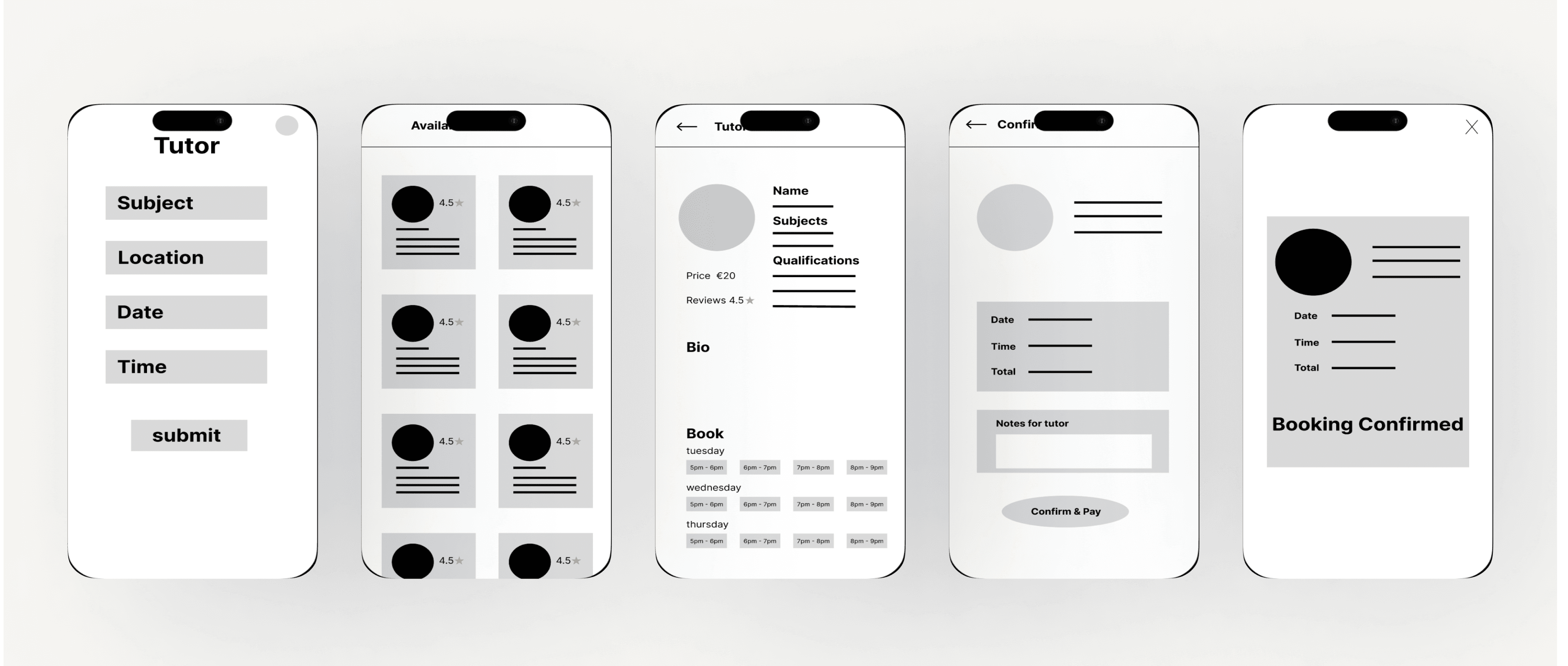
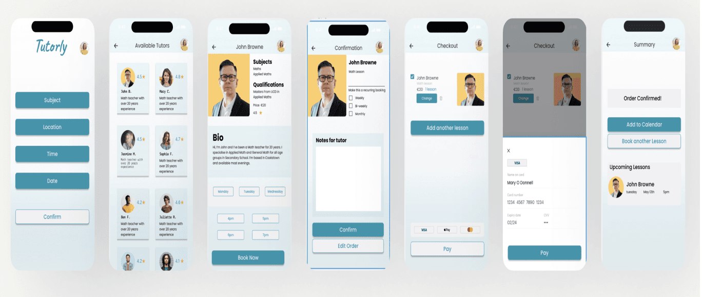
Hi-fi Prototype
I iterated on the lo-fi design based on research and testing. In the hi-fi design, I’ve included a recurring booking button on the confirmation page. Also, I redesigned the day and time booking buttons to make them bigger and easier to read, with a ‘book now’ button to continue the user flow. On the confirmation page, I’ve added an option to add the class to the users calendar, covering all the feedback from the usability study.
Next Steps & Reflections
In time, I’d like to continue developing this project to further test my design skills. I want to test the hi-fi prototype and make the buttons function as they would in a real app.
If I were to do this project again, I would conduct more in-depth research and include another research method to get a broader understanding of the users needs.
Tutorly: An App to Find 1-1 Tuition
User-Centered Design for Enhanced Educational Accessibility
Portfolio Overview
Project Type: App Testing and Development
Role: UX Research, Usability Testing, UX/UI Design
Project Duration: November 2024 - April 2025
Industry: Ed-Tech
Goals: Build a hi-fi search and booking function for the Tutorly App
Context
This project was part of my UX certificate course from Google to test UX principles and learn how to build a hi-fi prototype app using Figma. I know this is a current issue facing parents and students in Ireland, so I was able to empathise and build personas based on real people, making this project feel real, rather than a non-contextual study piece.
The Problem
The demand to achieve the best Leaving Cert (Irish final school exams) has become evermore competitive. Many parents are turning to extra 1-1 tuition for their children to help them excel in their exams, with hopes they will get accepted to the university course they hope for. The demand is growing and typically tutors are found through word of mouth. This leaves some students unable to find tutors. I want to create an app that makes it accessible for all students to find a tutor for extra tuiton.
Goals
Finding the top 3-5 pain points and needs of users when finding and booking a tutor through interviews
To develop and iteratively test a MVP to search and book a tutor based on research findings
To demonstrate proficiency in hi-fi prototyping by creating a visually polished and interactive search and booking system for the Tutor App, by scoring at least 4 out of 5 from a user satisfaction score
3-5 Pain Points
MVP
Hi-fi Prototype
Discovery & Research
To test my first goal of finding the key pain-points experienced when currently booking a tutor, I conducted semi-structure interviews of a student (over 18), 2 parents and a teacher who currently provides extra tuition. I made sure to find a mix of users from cities (Dublin) and rural towns (Donegal).
Semi-structured user interviews
I used a mix of phone and in-person interviews due to location and I modified the questions based on the different users. It was important to find an in-depth understanding of each stakeholder’s pain-points to make sure the app fits all their needs. My questions focused on the current methods used to book tuition, how tutors are found and what their version of an ideal situation find and book tutors would be.
Key Findings
Tutors are mostly found through word of mouth. Parents are students tend to be frustrated that tutor’s schedules are booked up quickly and it’s hard to find alternatives. The teacher told me that he is inundated with messages and has no way to show he’s fully booked.
Parents didn’t know if they were paying over the odds due to the perceived lack of tutors. Prices seem to be constantly rising said a parent who is finding tutors for their 3rd child. The tutor mentioned larger institutions took a large chunk of the fee, inflating the price.
Both parents and the tutor said they sourced tuition through paper ads in local shops. Parent’s cited the lack of understanding credibility and verification with university students often advertising.
Word of Mouth
No Price Clarity
Lack of Credibility
Limited Options
User Personas


User Journey Map

Lo-fi Mock-up
Based on my findings, I iterated several options on paper wireframes, which I then brought to Figma to create a lo-fi mock-up. I included tutor reviews, price and a list of availability the tutor has. This directly solves the four main pain-points found in the research: lack of clarity of availability, price comparison, verification and credibility and an online option to book a tutor.
Usability Testing
I had 5 people test a lo-fi prototype of booking a lesson.
Key Findings
The availability
buttons were
hard to read
‘I’d like to be able to
make a recurring
booking’
It would be nice to
add my bookings
to my calendar
‘I think you forgot
to add a button to
confirm booking’
I’m glad I tested the lo-fi prototype before moving forward. Basic mistakes like not adding a confirmation button is an easy fix and better to catch at this stage. Otherwise, there’s only a small amount of feature I need to include in the hi-fidelity design.
Hi-fi Prototype
I iterated on the lo-fi design based on research and testing. In the hi-fi design, I’ve included a recurring booking button on the confirmation page. Also, I redesigned the day and time booking buttons to make them bigger and easier to read, with a ‘book now’ button to continue the user flow. On the confirmation page, I’ve added an option to add the class to the users calendar, covering all the feedback from the usability study.
Next Steps
In time, I’d like to continue developing this project to further test my design skills. I want to test the hi-fi prototype and make the buttons function as they would in a real app.
If I were to do this project again, I would conduct more in-depth research and include another research method to get a broader understanding of the users needs.